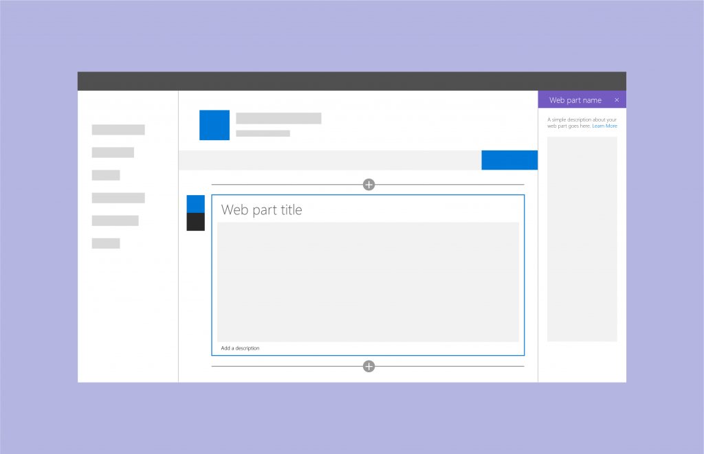


Anyone who has worked with me on a SharePoint project knows that I firmly believe that a good custom web part must be indistinguishable from the out-of-the-box SharePoint web parts. They need to look and behave like they were written by whichever awesome team at Microsoft is responsible for writing those things.
Someone at Microsoft must feel the same way as I do because they took the take to create a nice SharePoint Design web site dedicated to the SharePoint design principles; not just for web parts, but for sites and pages as well.
If you haven’t visited it yet, I encourage you to do so now. Go ahead, I’ll wait.
I like that Microsoft is documenting their design principles for web part look and feel, but they do not explain how to achieve the awesome look they show.
That’s why I’ve created this series of posts on how to build SharePoint web parts, using SPFX, that follow the Microsoft design principles. Each post is intended as a companion to their respective section in the SharePoint Design site.
At the end of this series, you’ll be able to build beautiful web parts that will conform to Microsoft’s design principles and that will be indistinguishable from the out-of-the-box web parts.
In other words, the perfect web part.
Luke Wroblewski, a Product Director at Google once wrote:
“Getting in the way of a speeding freight train usually doesn’t end well. It takes a lot of effort to shift the course of something with that much momentum. Rather than forcing people to divert their attention from their primary task, come to where they are.”
Every web part with custom styles, fonts, and designs that are hosted within a page competes for your user’s attention — in a bad way. You’re asking your users to learn a new user interface with every custom-layout web part you create.
Instead of focusing on your content, your users have to struggle just to make sense of your user interface.
In UX (user experience) circles, that’s a concept called Cognitive overload.
Cognitive overload is often caused by overstimulation. If you want a good example of overstimulation, go visit LingsCars.com and notice how you’ll have to struggle to take in all the information on that page.
In user experience, it is often said that:
The best user experience is the one the user doesn’t notice
In SharePoint, your users are already familiar with the web part user interface and layout. They know where to look for the “Show all items” option, or what happens when they click on the pencil icon.
In this awesome article on cognitive load, they say that a way to reduce cognitive overload is to Follow time-proof conventions:
Don’t reinvent the wheel. Users don’t wanna take another driving lesson.
Dana Kachan
Following the SharePoint design principles for web parts is to follow an existing convention established in SharePoint and Office 365.
Many years ago, I was working with a brilliant developer. Well, he did all the work while I attended meetings and demoed all his hard work, pretty much.
One day, he figured out a problem to a very difficult issue. I can’t remember what it was, but it was one that most people we talked to said that it couldn’t be solved.
When he demoed it to me, I was impressed, and I told him so. But then I pointed out that he was using the wrong font and colors, and that there was a spelling mistake on his screen.
(I’m talking comic sans with italic and ugly green fonts. Yuck!!!)
He was shocked. He had just solved an impossible problem and I was complaining about a minor user interface issue?!!?
I explained to him that when we’ll demo his code to the client — who has no appreciation for how complicated the issue was and how amazing the solution was — all he will see is the ugly fonts, colors, and spelling mistakes. Instead of seeing a professional-looking solution, he’ll see something that looks amateurish. It will break — or at least chip away at — the trust he has in us.
A more recent example of this is when Game of Thrones was in its last season, people got really upset about a coffee cup that was visible in one of the scenes.

Everybody knows that Game of Thrones was not really filmed in a fantasy time where dragons existed, right?
So why did people get upset?
Because the coffee cup that was carelessly forgotten in a shot chipped away at people’s trust and respect for what was otherwise a beautifully produced show. It happened in the last season of the show when people were starting to criticize the writing and the rushed pace of the final episodes, and many people couldn’t overlook it.
When you design your own look and feel within SharePoint, you’re also chipping away at your user’s trust.
If you’re a designer who’s anti-Microsoft and says “SharePoint looks like crap” and “I can do a better job myself”, you’re absolutely right. You don’t need to read this series of blog posts.
If you’re a developer who is new or somewhat experienced with creating SPFx web parts, but typically doesn’t pay attention to how your web parts look — as long as they work, you may find this series of posts useful.
Join me tomorrow for the first real article in the series: Web Part Titles.