


I’m not a great presenter.
I have been working in IT for over thirty years, during which time I have done many technical demos… and failed many of them.
However, I’m always trying to improve myself. Since I started presenting regularly on the PnP community calls and the demos are posted on YouTube, I reached out to Andrew Benson (who does an amazing job editing and publishing the videos) for his help with a demo checklist that I can use to improve the quality and consistency of my demos.
I hope that this checklist will help someone else preparing for their technical demos.
Let’s get one thing straight, though: I’m not sharing this list because I think I’m an awesome presenter (I’m not), but because I hope that it’ll help others who — like me — are on a continued journey to improve their presentation skills.
If you have other tips you’d like to share, feel free to use the comments section.
PC fans are noisy. When you use a microphone, the fan sound is often picked up by the microphone.
Unless you’re a professional broadcaster with a fancy microphone, you should use a headset.
Headsets are great because they keep your microphone a constant distance from your mouth.
If you use a wireless headset, make sure it is charged before your presentation. Alternatively, use a wired headset so you don’t have to worry about batteries.
(I use a Jabra Evolve 75, which seems to be adequate for me)
In a pinch, you can use your built-in microphone on your computer, but keep in mind that you’ll sound far away, and your microphone will pick up every sound in the room. When I review old demos I did with my Surface Studio 2’s built-in microphone, I can hear when I move my mouse and my keyboard clacking as I type on it.
According to Andrew, you should use XLR – vocal/speech microphones. Avoid using USB mics because of the lousy sound quality.
If you’re going to buy a microphone, here’s Andrew’s recommendations from low cost to higher end:
If you aren’t using a headset, make sure that your speakers aren’t too loud so that you don’t generate echo when you speak.
Your built-in PC camera is probably adequate — just make sure that you elevate your PC so that the audience can get a straight view of you (instead of a view of inside your nostrils).
720p or 1080p HD is plenty — no need for 4k. Teams does not conference or stream 4K, so your picture quality will be lowered to 1080p anyway.
Andrew recommends a 1080p webcam with a built-in tripod so you can position the camera on a stable surface rather than straddling on your unstable laptop screen.
While they are cool, avoid using background effects. You should strive to appear as real and natural as if you were in the same room. With backgrounds, you often appear like a cut-out. With that being said, my office is also used for storage, so I always have a background on.
Most importantly, it makes it a lot harder to subtly cut and splice videos when you use background effects.
If you’re going to be demoing something, your screen resolution is pretty important.
Let’s put it plainly: it does not matter whether you use 720p or 1080p; the key is to use a 16:9 ratio.
Here is a list of resolutions that will provide a 16:9 ratio:
| Resolution | Examples | Dimensions |
|---|---|---|
| Wide XGA (WXGA-H) | Minimum, 720p HDTV | 1280×720 |
| Full HD (FHD) | 1080 HDTV (1080i, 1080p) | 1920×1080 |
| Wide Quad HD WQHD | Dell UltraSharp U2711, Dell XPS One 27, Apple iMac | 2560×1440 |
| Wide QXGA+ (WQXGA+) | HP Envy TouchSmart 14, Fujitsu Lifebook UH90/L, Lenovo Yoga 2 Pro | 3200×1800 |
| 4K Ultra HD 1 (4K UHD-1) | 2160p, 4000-lines UHDTV (4K UHD) | 3840×2160 |
| 8K Ultra HD 2 (8K UHD-2) | 4320p, 8000-lines UHDTV (8K UHD) | 7680×4320 |
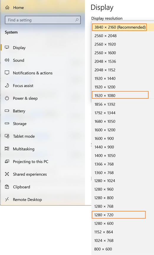
Please note that if you use a higher resolution, you need to make sure that all font sizes are big enough for everyone in the audience to be able to read your text.
When using a browser, make sure that your app resolution is at 100%.
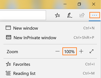
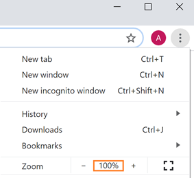
When presenting in PowerPoint, make sure to use the Presenter mode, which will render your presentation at 100% resolution and use your full screen.
To use the presenter mode, hit F5 to start from the first slide, or SHIFT-F5

Yes, yes, dark theme is cool. But when it comes to presenting — especially if you’re showing code in Visual Studio Code / Visual Studio — use a light theme.
You have a very short period of time to convey your message. If you’re demoing during one of the PnP community calls, you typically have between 10 to 15 minutes to do your demo.
Try to explain to your audience why they should care about your demo; present the current state, then your “improved” state so that people can quickly understand what’s in it for them.
Once you have introduced yourself (see below), show a demo as quickly as possible. Or, at least, show a teaser that will keep your audience interested.
Resist the urge to talk for 10 minutes about your code without showing your demo or your audience will get bored and fall asleep.
Make sure that you’re able to answer the audience’s “what’s in it for me?”
You don’t need to create a huge PowerPoint presentation here; just something that provides your name, title, and contact information.
You might need a slide to explain your usage scenario or to show the before/after pictures.
If you want to, you can include an architecture diagram — but it is often unnecessary.
Avoid using transition and animations. They don’t show well on Teams and/or YouTube videos.
If you’re going to show code, it’s a good idea to create screen shots of your code in PowerPoint and highlight the important sections.
I know, you may think that it is cooler to show code directly in Visual Studio Code/Visual Studio, but it invariably results in blurry code as you scroll around and move your mouse around.
Plus: it forces you to think ahead of time about what code you want to show.
You should wrap up your companion deck with a demo summary and reference slides. It’s a good idea to provide a link to your source code.
Take the time to include links to the articles, blog posts, previous demos that you may refer to during your demo.
No matter how simple your demo is, you should always prepare for the eventuality that everything will go wrong.
Do a dry run of your demo and take screen shots throughout so that if the demo gods are not playing nice, you’ll have something to show.
If you’re preparing for a PnP call demo, David Warner II — who does a screenshot summary of every PnP call — will most likely contact you to ask if you have any slides before you’re scheduled to present. Make sure to include your screenshot slides.
If you’re doing a demo for a PnP call, it will be recorded and posted on YouTube. You may want to write a 100-word description for your demo title, description. Make sure to include the tools or technologies you used if that’s what your demo is about.
Be ready! People may ask about compatibility, licensing, availability, why you used this approach instead of another one, etc.
If you’re demoing work that you did for a customer, you should obtain a written permission from them before you mention them and/or show their solution. Otherwise, make sure to make to sanitize or otherwise make your demo so that nobody gets in trouble.
Fifteen minutes before the call:
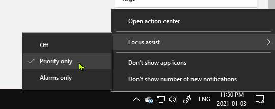
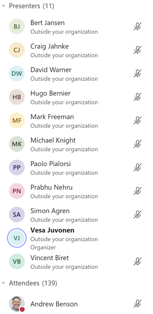
When it is your time to demo:
When you want people to focus on something on the screen, it’s always a good idea to zoom in or highlight the screen in some way.
Luckily, there’s free tool by Microsoft called ZoomIt which is designed to help during presentations.
After you install ZoomIt, you can use these useful shortcut keys to enable ZoomIt features:
| Shortcut key | Function |
|---|---|
| Ctrl-1 | Begin Zoom-In mode |
| Ctrl-2 | Begin drawing (while not zoomed in) |
| ↑ | Zoom In |
| ↓ | Zoom Out |
| Left-Click | Begin drawing (while zoomed in) |
| R, B, Y, G, O, P | Change pen color to red, blue, yellow, green, orange, purple |
| Ctrl-↑ | Increase pen size |
| Ctrl-↓ | Decrease pen size |
| E | Erase |
| ESC | Stop zoom |
| Tab | Draw ellipse (while drawing) |
| SHIFT | Draw a straight line (while drawing) |
| CTRL | Draw a rectangle (while drawing) |
| SHIFT+CTRL | Draw a rectangle (while drawing) |
| T | Type (while zoomed in) |
If you want to see cool demos using ZoomIt, take a look at presentations by David Warner II.
There are other cool features you can use (like timers, blanking the screen, etc.). I recommend you take visit the ZoomIt site for more information.
When you’re in PowerPoint presenter mode, it can be hard to switch to your desktop to show your demo, and switch back. It’s like PowerPoint doesn’t want to stop presenting, or it doesn’t want to back to presenting…
I like use Windows 10’s Desktop functionality to create multiple desktops. With multiple desktops in Windows, you can assign which “desktop” you want the application to appear in. While you’re showing a desktop, only the applications from that desktop will show up. When you switch to another desktop, it hides the applications from the previous desktop and shows applications from the current desktop only.
I usually have a Work desktop (so I can work while waiting for the call), a Demo desktop (where I show the application I’m going to demo), and a Presentation desktop, where I have PowerPoint in presentation mode.

To use multiple desktops, follow these steps:
The great thing is when you’re sharing your desktop in Teams, it shows the content your monitor sees — regardless of which desktop shows.
I hope that this checklist will help you prepare for your demo.
If you’re looking for inspiration, take a look at these demos which follow the format discussed above:
I hope this helps?
Image by Rudy and Peter Skitterians from Pixabay